

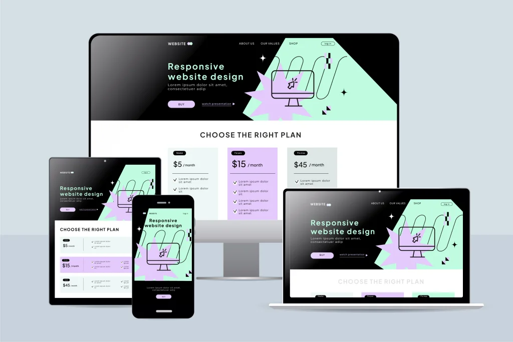
Why Mobile-Responsive Web Design Is Essential in 2026
In 2026, having a website that works properly on mobile devices is no longer an optional feature—it is a fundamental requirement for doing business online. Customers increasingly use smartphones and tablets to search for businesses, compare services, read reviews, shop online, complete forms, and contact companies.
If your website looks professional on a desktop computer but becomes difficult to navigate on a smartphone, you could be losing potential customers before they ever have the opportunity to learn about your business.
A mobile-responsive website automatically adapts its layout, images, text, navigation, and other elements to different screen sizes. Whether someone visits your website using a desktop computer, laptop, tablet, or smartphone, they should receive a smooth and professional experience.
What Is Mobile-Responsive Web Design?
Responsive web design is an approach to website development that allows a website to automatically adjust according to the visitor’s device and screen size.
Instead of creating completely separate desktop and mobile websites, responsive design uses flexible layouts and styling to provide a consistent experience across devices.
A properly responsive website should provide:
- Easy-to-read text without unnecessary zooming
- Mobile-friendly navigation and menus
- Buttons that are easy to tap
- Images that scale correctly
- Forms that work properly on smaller screens
- Content that fits within the screen
- Appropriate spacing between elements
- Fast and intuitive navigation
The goal is simple: visitors should be able to use your website comfortably regardless of the device they choose.
Mobile Users Expect a Smooth Experience
Modern consumers have very little patience for websites that are difficult to use.
Imagine a potential customer searches for your services on their smartphone and opens your website. The text is extremely small, images extend beyond the screen, the menu is difficult to open, and they have to zoom in just to tap the contact button.
Even if your business provides excellent services, that experience can create a poor first impression.
A responsive website removes these obstacles. Visitors can immediately understand what your business offers, navigate between pages, view your services, and take the next step.
Responsive Design Can Improve Your SEO
Mobile usability is also important for search engine optimization.
Search engines want to provide users with websites that deliver useful information and a positive browsing experience. A website that performs poorly on mobile devices can create usability and performance problems that may make competing websites more attractive to both users and search engines.
Responsive design supports SEO by helping improve important aspects of your website, including:
- Mobile usability
- Page experience
- Content accessibility
- Navigation
- Website performance
- User engagement
Responsive design alone will not guarantee higher Google rankings, but it provides an important technical foundation for a strong SEO strategy.
Better User Experience Can Lead to More Conversions
Your website should do more than look attractive. It should encourage visitors to take action.
Depending on your business, that action could be requesting a quote, making an appointment, purchasing a product, submitting a contact form, calling your office, or signing up for a service.
Responsive design makes these actions easier.
For example, a mobile visitor should be able to tap your phone number to call your business directly. Contact forms should fit comfortably on the screen, and important call-to-action buttons should be clearly visible without being difficult to tap.
Reducing unnecessary friction can help turn more website visitors into enquiries and customers.
Responsive Websites Build Trust and Credibility
Your website is often one of the first interactions a potential customer has with your company.
An outdated or poorly formatted mobile website can make a business appear less professional. Visitors may wonder whether the company is active, trustworthy, or attentive to details.
A modern responsive website creates a much stronger first impression.
Consistent branding, readable typography, professional imagery, clear navigation, and well-designed mobile layouts communicate that your business takes its online presence seriously.
For businesses operating in competitive industries, that credibility can make an important difference when customers are deciding between several companies.
Mobile-Friendly Navigation Matters
Desktop navigation does not always translate effectively to smaller screens.
A large navigation bar containing numerous menu items can become cluttered on a smartphone. Responsive websites solve this problem by adapting navigation for mobile users.
Common solutions include collapsible menus, clearly structured service categories, prominent contact buttons, sticky navigation, and strategically positioned calls to action.
Visitors should never have to search extensively for essential information such as your services, phone number, location, pricing, or contact page.
The fewer obstacles users encounter, the easier it becomes for them to interact with your business.
Responsive Design Is Essential for E-Commerce
Mobile responsiveness is particularly important for e-commerce websites.
Online shoppers need to browse products, view images, select options, add products to their cart, enter information, and complete payments from smaller screens.
A poorly designed mobile checkout process can result in abandoned purchases.
A responsive e-commerce website should make product discovery and purchasing as straightforward as possible. Product images should display correctly, pricing should be easy to understand, buttons should be accessible, and checkout forms should be optimized for mobile input.
Creating a smoother shopping experience can help businesses convert more mobile visitors into paying customers.
Website Speed and Responsive Design Work Together
A responsive website should not only look good—it should also perform efficiently.
Large images, unnecessary scripts, excessive animations, and poorly optimized website elements can make mobile pages slow to load.
Modern responsive development should therefore consider performance from the beginning.
Important optimization practices include:
- Compressing and properly sizing images
- Using modern image formats where appropriate
- Minimizing unnecessary scripts
- Optimizing CSS and JavaScript
- Using browser caching effectively
- Choosing reliable website hosting
- Avoiding excessive animations and plugins
- Testing website performance on real mobile devices
A fast and responsive website creates a much more enjoyable experience for visitors.
Responsive Design Supports Different Screen Sizes
One common mistake is designing a website specifically for one desktop size and one smartphone size.
Modern users access websites through an enormous range of devices. Smartphones alone have different screen dimensions, resolutions, and orientations. Tablets, laptops, ultrawide monitors, and foldable devices create even more variations.
Professional responsive design uses flexible layouts rather than relying exclusively on fixed dimensions.
Content should adapt naturally as screen space changes.
This approach helps future-proof your website because it is designed around flexible behavior rather than one specific device.
Signs Your Website Needs Better Mobile Optimization
If your website has not been redesigned or professionally reviewed recently, it is worth testing it on several mobile devices.
You may need responsive improvements if:
- Visitors have to zoom to read your content.
- Text or images extend outside the screen.
- Buttons are too small or close together.
- Your navigation menu is difficult to use.
- Contact forms do not display properly.
- Popups cover important content.
- Pages take too long to load.
- Tables or pricing sections break on smaller screens.
- Important calls to action disappear on mobile.
- Your website looks noticeably outdated compared with competitors.
These issues may appear minor individually, but together they can significantly affect the overall customer experience.
Mobile-First Thinking Is Important in 2026
Businesses should no longer treat the mobile version of their website as an afterthought.
Mobile usability should be considered throughout the entire design and development process—from navigation and page structure to typography, images, forms, calls to action, and website performance.
This does not mean ignoring desktop users. Instead, the goal is to create an adaptable website that provides an excellent experience across all major devices.
A professional website should feel intentionally designed whether it is displayed on a 6-inch smartphone or a large desktop monitor.
Final Thoughts
In 2026, your website needs to meet customers wherever they are—and increasingly, that means on mobile devices.
A well-designed responsive website can provide a better user experience, strengthen your professional image, support SEO, improve accessibility, simplify navigation, and make it easier for potential customers to contact or purchase from your business.
If your existing website is difficult to navigate on a smartphone, loads slowly, or does not adapt correctly to different screen sizes, investing in responsive web design can significantly improve your overall digital presence.
Your website is available to customers 24 hours a day. Make sure it provides a professional, convenient, and consistent experience on every screen.
