

Responsive Web Design: Why Mobile-Friendly Websites Win
Introduction
The way people access the internet has changed dramatically. Today, users browse websites from smartphones, tablets, laptops, and desktop computers throughout the day. With mobile devices becoming the primary way many people search for information, businesses need websites that provide a smooth experience across every screen size.
This is where responsive web design becomes essential.
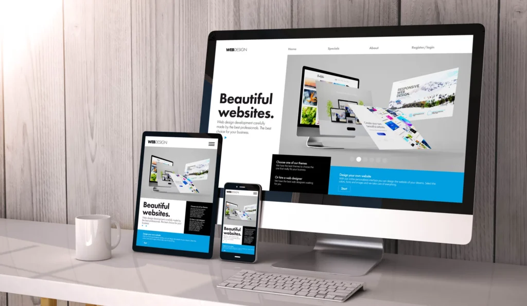
Responsive web design ensures that a website automatically adjusts its layout, images, content, and functionality based on the device a visitor is using. Instead of creating separate websites for desktop and mobile users, responsive design creates one flexible website that works seamlessly everywhere.
A mobile-friendly website is no longer just an option—it is a key factor in attracting visitors, improving user experience, increasing conversions, and staying competitive online.
What Is Responsive Web Design?
Responsive web design is an approach to website development that allows web pages to adapt to different screen sizes and devices.
A responsive website automatically adjusts elements such as:
- Page layouts
- Images and videos
- Text size
- Navigation menus
- Buttons and forms
- Content spacing
For example, a website that looks perfect on a desktop computer will automatically reorganize itself for a smaller smartphone screen, making it easier for users to read and interact with.
Responsive design is achieved using modern frontend technologies such as:
- HTML for website structure
- CSS media queries for responsive layouts
- Flexible grids and layouts
- Responsive images
- JavaScript frameworks and libraries
The goal is simple: provide every user with the best possible browsing experience.
Why Mobile-Friendly Websites Are Important
1. More Users Are Browsing on Mobile Devices
Mobile internet usage continues to grow as smartphones become more powerful and accessible. Many customers now search for businesses, compare products, read reviews, and make purchases directly from their phones.
If a website is difficult to use on mobile, visitors may quickly leave and choose a competitor with a better experience.
A mobile-friendly website ensures that users can:
- Easily navigate pages
- Read content without zooming
- Click buttons comfortably
- Complete forms quickly
- Find information faster
Meeting users where they are is one of the biggest advantages of responsive web design.
2. Improves User Experience
User experience plays a major role in the success of a website. Visitors expect websites to load quickly, look professional, and work smoothly regardless of the device they use.
Responsive web design improves user experience by providing:
- Easy navigation
- Clear content organization
- Better readability
- Faster interactions
- Consistent branding
When users have a positive experience, they are more likely to stay longer, explore more pages, and become customers.
3. Helps Improve Search Engine Rankings
Search engines prioritize websites that provide a good experience for users. Mobile responsiveness is an important factor in modern SEO strategies.
A responsive website can help improve search visibility by:
- Providing a better mobile experience
- Reducing bounce rates
- Improving page performance
- Making content easier for search engines to understand
A website that works well on mobile has a stronger chance of competing in search results.
4. Increases Website Conversions
A website’s main goal is usually to encourage visitors to take action, whether that means making a purchase, submitting a form, booking an appointment, or contacting a business.
A poor mobile experience can prevent users from completing these actions.
Responsive design improves conversions by creating:
- Easy-to-use contact forms
- Mobile-friendly buttons
- Simple checkout processes
- Clear calls-to-action
- Smooth navigation
When visitors can easily complete tasks, businesses have a greater opportunity to generate leads and sales.
5. Provides a Consistent Brand Experience
Your website represents your brand. Users should have the same professional experience whether they visit from a phone, tablet, or computer.
Responsive design maintains consistency across devices by ensuring:
- Brand colors remain the same
- Images display correctly
- Content remains organized
- Navigation works properly
A consistent digital experience helps build trust and recognition.
6. Improves Website Speed and Performance
Mobile users often browse on slower networks compared to desktop users. Responsive websites are designed with performance in mind, helping pages load faster and operate efficiently.
Professional responsive development includes:
- Optimized images
- Clean code
- Reduced unnecessary elements
- Efficient loading techniques
Faster websites improve user satisfaction and encourage visitors to stay longer.
7. Saves Time and Maintenance Costs
Before responsive design became common, businesses often needed separate desktop and mobile websites. Managing multiple versions required additional time, resources, and maintenance.
Responsive websites simplify management because:
- There is only one website to update
- Content changes apply everywhere
- Maintenance becomes easier
- Development costs are reduced
A single responsive website is more efficient and easier to manage long-term.
8. Supports Better Accessibility
Responsive websites are also better positioned to provide accessible experiences for all users.
A well-designed responsive website helps ensure:
- Content is readable on all devices
- Navigation is easier
- Buttons are accessible
- Information is organized clearly
Accessibility improves usability and allows more people to interact with your website.
Key Elements of Effective Responsive Web Design
A successful responsive website includes several important elements:
Flexible Layouts
Layouts should automatically adjust based on screen size instead of using fixed dimensions.
Responsive Images
Images should scale properly without slowing down the website or appearing distorted.
Mobile-Friendly Navigation
Menus should be easy to access and use on smaller screens.
Touch-Friendly Design
Buttons and interactive elements should be large enough for users to tap comfortably.
Fast Loading Performance
Every element should be optimized to provide a quick browsing experience.
Why Businesses That Invest in Responsive Design Win
Companies with mobile-friendly websites gain a competitive advantage because they provide a better experience for modern customers.
Responsive websites help businesses:
- Attract more visitors
- Keep users engaged
- Improve SEO performance
- Increase leads and sales
- Build customer trust
- Stay ahead of competitors
In today’s digital marketplace, a website that works everywhere is essential for success.
Conclusion
Responsive web design is no longer just a design trend—it is a fundamental requirement for modern websites. As more users rely on mobile devices, businesses must ensure their websites are fast, accessible, and easy to use on every screen.
A mobile-friendly website creates better experiences, improves search performance, and increases the chances of turning visitors into customers.
By investing in responsive web design, businesses can build websites that are ready for today’s users and prepared for the future of digital experiences.
