

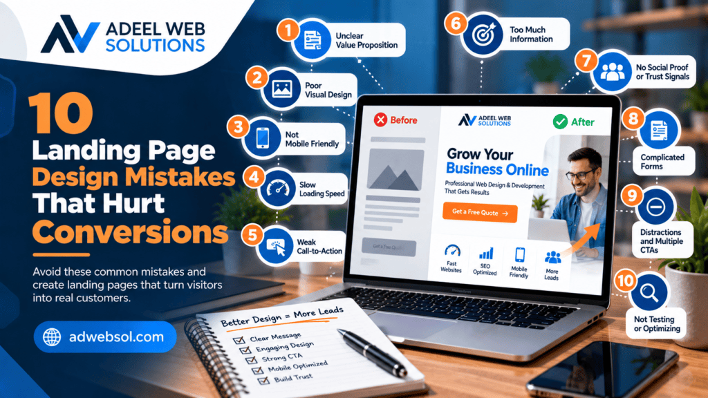
10 Landing Page Design Mistakes That Hurt Conversions
A landing page can look professional and still fail to generate leads.
Businesses often invest in advertising, SEO, social media, and email marketing to attract visitors, but traffic alone does not produce results. Once someone reaches your landing page, the page needs to clearly communicate your offer, establish trust, and guide the visitor toward a specific action.
That action might be:
- Requesting a quote
- Booking a consultation
- Calling your business
- Scheduling an appointment
- Completing a contact form
- Registering for a service
- Making a purchase
Small design and usability problems can create unnecessary friction and cause potential customers to leave without converting.
Understanding the most common landing page design mistakes can help you create pages that provide a clearer, faster, and more persuasive customer experience.
Here are 10 landing page design mistakes that can hurt conversions and what you can do to improve them.
1. Using a Weak or Confusing Headline
Your headline is one of the first elements visitors notice.
If it is vague, confusing, or unrelated to the reason someone visited the page, you can lose their attention quickly.
Headlines such as:
Welcome to Our Website
or:
Quality Solutions for Everyone
provide very little information.
Visitors still need to determine:
- What do you offer?
- Is this relevant to me?
- Where do you provide it?
- Why should I continue reading?
A stronger headline communicates the primary service or benefit immediately.
For example:
Professional Website Design That Helps Your Business Generate More Leads
For a local roofing company:
Professional Roof Repair & Replacement in Wichita, KS
For a medical practice:
Quality Healthcare for Patients in Gungahlin
The exact wording depends on the business, but clarity should come before cleverness.
How to Improve Your Headline
A strong headline often includes one or more of the following:
- Main service
- Primary benefit
- Target customer
- Location
- Desired outcome
Keep it easy to understand.
Your visitor should be able to identify the purpose of the page within seconds.
2. Having Too Many Calls to Action
A landing page should usually have one clear primary goal.
A common mistake is presenting visitors with too many unrelated actions.
For example:
Get a Quote
Read Our Blog
Follow Us on Facebook
Download Our Guide
View All Services
Subscribe to Our Newsletter
Every additional choice can compete with the action that matters most.
If the purpose of the landing page is to generate quote requests, most major calls to action should support that goal.
You can repeat the same CTA throughout the page.
For example:
Hero → Get a Free Quote
Services → Get a Free Quote
Testimonials → Get a Free Quote
Final CTA → Get a Free Quote
This reinforces the conversion path instead of constantly changing it.
How to Improve Your CTAs
Choose one primary conversion goal.
Then make sure your:
- Buttons
- Forms
- Headlines
- Supporting content
all help move visitors toward that action.
Secondary actions can still exist where necessary, but they should not compete visually with the primary goal.
3. Asking for Too Much Information in Your Form
Forms are one of the most important parts of many lead-generation landing pages.
They are also one of the easiest places to create friction.
Imagine a visitor wants a simple quote, but your form requests:
- First name
- Last name
- Phone
- Company
- Address
- City
- State
- ZIP code
- Budget
- Project type
- Project deadline
- Referral source
- Detailed message
Some of these fields may be useful eventually, but requiring all of them immediately can make the form feel like work.
Ask Only What You Need
For an initial enquiry, a simpler form may request:
- Name
- Phone
- Service Needed
- Short Message
More complex services may genuinely require additional qualification fields.
The goal is not to make every form extremely short. The goal is to remove unnecessary fields.
Ask yourself:
Do we actually need this information before speaking with the customer?
If the answer is no, consider collecting it later.
Make Mobile Forms Easy
Mobile users should not need to zoom, scroll horizontally, or struggle with tiny fields.
Use:
- Large form fields
- Clear labels
- Comfortable spacing
- Simple layouts
- Easy-to-tap buttons
Always test forms on smaller screens.
4. Using a Slow Landing Page
Page speed can have a direct impact on user experience.
If visitors click an advertisement and then wait too long for the landing page to become usable, some may leave before seeing your offer.
Landing pages can become slow because of:
- Oversized images
- Large videos
- Heavy animations
- Too many plugins
- Excessive JavaScript
- Multiple tracking scripts
- Unoptimized fonts
- Poor hosting
- Unnecessary third-party tools
Keep the Page Lightweight
Optimize images before uploading them.
Avoid using extremely large files when smaller optimized versions provide the same visual result.
Review whether animations and third-party scripts genuinely contribute to conversions.
A landing page does not need every visual effect available in your page builder.
Test More Than the Performance Score
Performance tools are useful, but your goal should not simply be achieving a perfect score.
Test how quickly real visitors can:
- See the main content
- Understand the offer
- Interact with buttons
- Complete the form
Real usability matters more than chasing a number.
5. Ignoring Mobile Design
A landing page that looks excellent on a desktop computer can still perform poorly on mobile.
Common mobile landing page problems include:
- Oversized headings
- Tiny buttons
- Horizontal scrolling
- Overlapping content
- Forms extending outside the screen
- Large empty spaces
- Difficult navigation
- Images that load slowly
- Popups covering important content
Simply using a responsive WordPress theme does not guarantee that every landing page is optimized correctly.
Design for Mobile Actions
Think about what a mobile visitor wants to do.
They may want to:
- Call your business
- Request a quote
- Book an appointment
- Submit a short form
- Find your location
Make those actions easy.
Phone numbers should be clickable where appropriate.
Buttons should be large enough to tap comfortably.
Forms should generally use simple layouts.
Test the Actual Page
Check your landing page on different screen sizes after making changes.
Do not rely only on the desktop preview.
6. Failing to Build Trust
A visitor may like your service but still hesitate because they do not know whether they can trust your business.
A landing page that makes large promises without evidence can feel risky.
Trust signals may include genuine:
- Customer testimonials
- Reviews
- Certifications
- Professional memberships
- Project examples
- Client logos
- Years of experience
- Business information
- Licenses where relevant
For example, instead of simply saying:
We Are the Best Website Design Company
show potential customers:
- Real projects
- Genuine testimonials
- Services delivered
- Clear contact information
Evidence is usually more persuasive than unsupported claims.
Avoid Fake Social Proof
Do not use:
- Fake reviews
- Fake customer photos
- Fabricated statistics
- Fake awards
- Misleading logos
Trust signals should be accurate and verifiable where appropriate.
The purpose is to build genuine credibility.
7. Creating a Cluttered and Confusing Layout
Trying to include too much information above the fold is another common landing page mistake.
The hero section might contain:
- Two headlines
- Multiple paragraphs
- Four buttons
- A video
- Several badges
- A form
- Social icons
- Multiple animations
Instead of increasing conversions, this can overwhelm visitors.
Create a Clear Visual Hierarchy
The page should guide the visitor’s attention.
A simple hierarchy could be:
Headline
Supporting Text
Primary CTA
Trust Signal
Then additional information can appear as the visitor scrolls.
Use White Space
White space gives content room to breathe.
It helps separate:
- Headlines
- Paragraphs
- Forms
- Images
- Buttons
Do not fill every empty area simply because space is available.
A cleaner design can make important elements easier to notice.
8. Sending Ad Traffic to an Irrelevant Page
One of the biggest conversion mistakes can happen before visitors even start reading the landing page.
The advertisement and landing page do not match.
For example, someone searches for:
Emergency Plumbing Repair
They click an advertisement promoting emergency plumbing.
But the link sends them to a general homepage discussing:
- Bathroom remodeling
- Water heaters
- Commercial plumbing
- New construction
- Company history
The visitor now has to search for the information they originally wanted.
Some will simply leave.
Maintain Message Consistency
Your advertising message and landing page should feel connected.
For example:
Advertisement: Emergency Plumbing Repair in Jacksonville
Landing Page Headline: Emergency Plumbing Repair in Jacksonville, FL
Then the page should focus primarily on that service.
This creates a more consistent journey:
Search → Advertisement → Landing Page → Conversion
Use Dedicated Landing Pages for Important Campaigns
If you advertise multiple services, consider creating dedicated pages for your major campaigns.
For example:
- Roof Repair Landing Page
- Roof Replacement Landing Page
- Commercial Roofing Landing Page
Each page can focus on the intent behind its corresponding campaign.
9. Using Weak or Unclear CTA Buttons
A visitor may understand your service but still not know what to do next.
CTA buttons such as:
Click Here
Submit
Learn More
can sometimes be too generic.
The CTA should communicate the next action whenever possible.
Examples include:
- Get a Free Quote
- Request a Consultation
- Book an Appointment
- Schedule a Call
- Get Your Estimate
- Start Your Project
Match CTA Text With the Actual Action
Do not use:
Get an Instant Quote
if the customer will only be submitting a form and waiting for someone to contact them.
A more accurate CTA might be:
Request a Quote
Setting accurate expectations helps maintain trust.
Make the Primary CTA Easy to Find
Your CTA should visually stand out from surrounding content.
However, you do not need to make every element on the page look like a button.
Use visual emphasis strategically.
10. Failing to Track and Improve the Landing Page
Even a professionally designed landing page should not necessarily remain unchanged forever.
One of the biggest mistakes businesses make is launching a page and never reviewing its performance.
Without measurement, you may not know:
- How many visitors convert
- Which campaigns generate leads
- Which devices visitors use
- Whether forms work
- Whether calls are generated
- Which traffic sources perform better
Track Important Conversion Actions
Depending on your campaign, useful conversion events may include:
- Form submissions
- Phone calls
- Appointment bookings
- Purchases
- Quote requests
- Important CTA clicks
Do not focus only on traffic.
A landing page receiving 5,000 visitors but producing very few qualified leads may need significant improvement.
Improve the Page Using Data
You may test changes to:
- Headlines
- CTA wording
- Hero content
- Form length
- Testimonials
- Page layout
- Offer presentation
Where sufficient traffic is available, structured A/B testing can help determine which version performs better.
Avoid changing everything simultaneously if you want to understand which adjustment made the difference.
Other Landing Page Problems That Can Reduce Conversions
The ten mistakes above are among the most important, but several additional issues can also affect performance.
Broken Forms
A beautiful landing page is useless if its enquiry form does not work.
Test forms regularly and verify that notifications reach the correct destination.
Poor Form Confirmation
After submission, visitors should understand whether their enquiry was successfully received.
Use a clear confirmation message or appropriate thank-you page.
No Clear Next Step
Tell visitors what happens after they submit their information.
For example:
Complete the form and our team will contact you to discuss your project requirements.
Outdated Information
Old prices, incorrect phone numbers, outdated offers, and expired promotions can damage trust.
Review campaign pages regularly.
Too Much Generic Stock Photography
Stock images can be useful, but excessive generic imagery can make a business feel less authentic.
Where possible, use real:
- Team photos
- Projects
- Office images
- Products
- Completed work
Difficult-to-Read Content
Avoid:
- Tiny fonts
- Very long paragraphs
- Poor contrast
- Excessive text
- Complicated terminology
Visitors should be able to scan the page quickly.
What Should a High-Converting Landing Page Include?
There is no single perfect structure for every business, but a strong starting point can include the following sections.
Hero Section
Include:
- Clear headline
- Supporting description
- Primary CTA
- Relevant image or visual
Trust Signals
Show genuine:
- Reviews
- Testimonials
- Certifications
- Project numbers
- Client logos
Customer Problem
Explain the problem the visitor is trying to solve.
Your Solution
Show how your service addresses that problem.
Benefits
Explain why the service matters to the customer.
Service Details
Clearly describe what is included.
Proof
Show:
- Projects
- Case studies
- Results
- Testimonials
Process
Explain how customers get started.
Lead Form
Make the form easy to understand and complete.
Final CTA
Finish with a clear next step.
This structure creates a natural progression:
Attention → Interest → Trust → Information → Action
Landing Page Design Should Support the Customer Journey
A landing page is not just a collection of attractive sections.
Every part should help visitors move toward a decision.
Think about the questions a potential customer may have:
Am I in the right place?
Your headline should answer this.
Can this business solve my problem?
Your service and benefits sections should answer this.
Can I trust this company?
Your testimonials, reviews, and project examples should help answer this.
What happens next?
Your CTA and form should make this clear.
When these questions are answered naturally, the page becomes easier to use.
Don’t Focus Only on Design
Visual design matters, but conversion optimization involves much more than appearance.
A landing page also needs:
- Strong messaging
- Fast performance
- Mobile responsiveness
- Clear CTAs
- Working forms
- Trust
- Accurate information
- Analytics
- Appropriate follow-up
A visually impressive page with a broken contact form will not generate useful results.
Likewise, a beautiful page that loads too slowly may lose visitors before they see the design.
Design and functionality need to work together.
Landing Page Speed and Conversion Optimization
Performance deserves particular attention when your business pays for traffic.
Every visitor arriving through advertising has a cost.
Sending paid traffic to a slow or broken page can waste part of that advertising investment.
Review:
- Image sizes
- Videos
- Scripts
- Fonts
- Plugins
- Hosting performance
- Caching
Keep important landing pages lightweight whenever possible.
Landing Page Conversion Tracking
Before running a major campaign, make sure you can measure important actions.
For a service business, this may include:
Primary Conversion: Form submission
Secondary Conversion: Phone call
For an e-commerce campaign:
Primary Conversion: Purchase
Secondary Conversion: Add to cart
The exact tracking strategy depends on your business.
The key is understanding whether your marketing traffic is producing valuable actions rather than simply page views.
Focus on Lead Quality
Increasing conversion rate is useful only when the conversions are relevant.
A misleading offer might generate many enquiries but very few real customers.
Your landing page should clearly communicate:
- What you offer
- Who you serve
- Where you operate
- What visitors can expect
This can help attract more appropriate prospects.
For some businesses, adding a small number of qualification questions may reduce total submissions but improve lead quality.
Conversion optimization should consider business outcomes, not only form volume.
Review the Entire Conversion Process
Landing page performance does not stop at the form submission.
Your follow-up process also matters.
Consider the complete journey:
Advertisement → Landing Page → Form Submission → Lead Notification → Follow-Up → Sales Conversation
If your landing page generates leads but nobody responds promptly or enquiries are sent to the wrong email address, the marketing process is still failing.
Test the entire journey regularly.
Create Landing Pages That Make It Easy to Take Action
The best landing pages remove unnecessary obstacles between the visitor and the desired action.
Avoid:
- Confusing headlines
- Competing CTAs
- Long forms
- Slow pages
- Poor mobile layouts
- Missing trust signals
- Cluttered designs
- Irrelevant campaign pages
- Weak buttons
- Missing conversion tracking
Instead, focus on clarity, trust, performance, usability, and a strong customer journey.
A landing page does not need to be complicated to generate leads.
It needs to make the right information easy to understand and the next step easy to complete.
Improve Your Landing Page Conversions With Professional Design
A successful landing page combines professional design with conversion strategy, responsive development, performance optimization, strong messaging, trust signals, and reliable lead-generation functionality.
At Adeel Web Solutions, we design and develop professional landing pages for businesses that want to turn more website visitors into enquiries and potential customers.
We can help with landing page design, WordPress development, responsive frontend development, contact forms, conversion tracking, website speed optimization, local landing pages, and ongoing conversion improvements.
Whether you are preparing a page for Google Ads, social media advertising, SEO, or another marketing campaign, we can create a focused landing page based on your business goals.
Want to improve an existing landing page or build a new conversion-focused page?
Contact Adeel Web Solutions to discuss your landing page design and development requirements.
